Graphic Design
That Speaks
Volumes
I design thoughtful, tactile branding and packaging that turns everyday products into unforgettable experiences.
Featured Clients
Add quote here
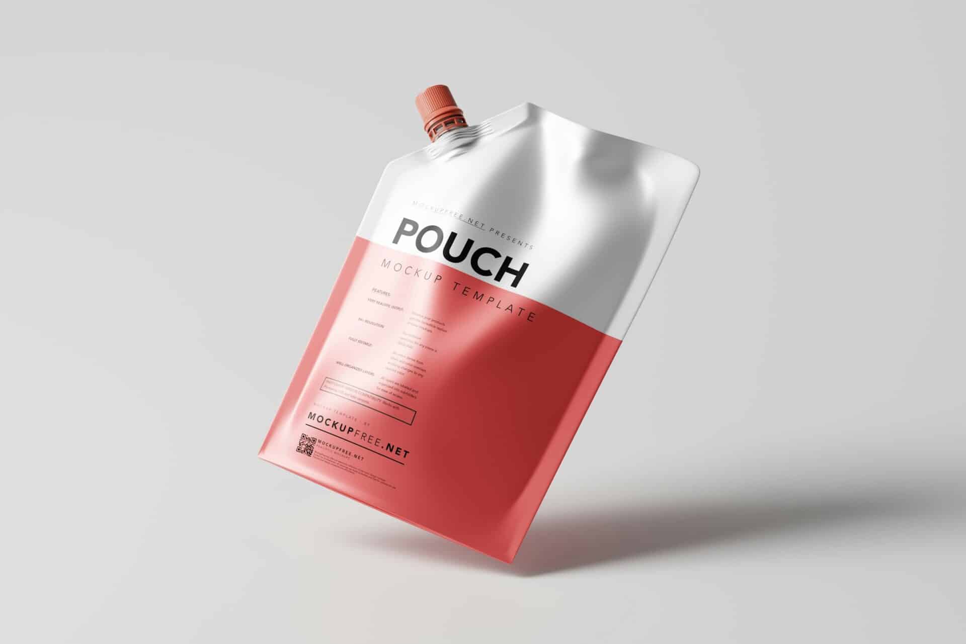
Sustainable Pouch Packaging
Packaging for a range of plant-based food products launching in a new format — a flexible stand-up pouch. The challenge was to make a format associated with budget grocery products feel premium, considered, and true to the brand’s environmental values.
Bold, full-bleed graphics wrap the entire package, with a different vibrant ground per variant for shelf standout. Produced on a certified compostable substrate, and the design makes that part of the story. The range sold out its initial run within six weeks.
View Details
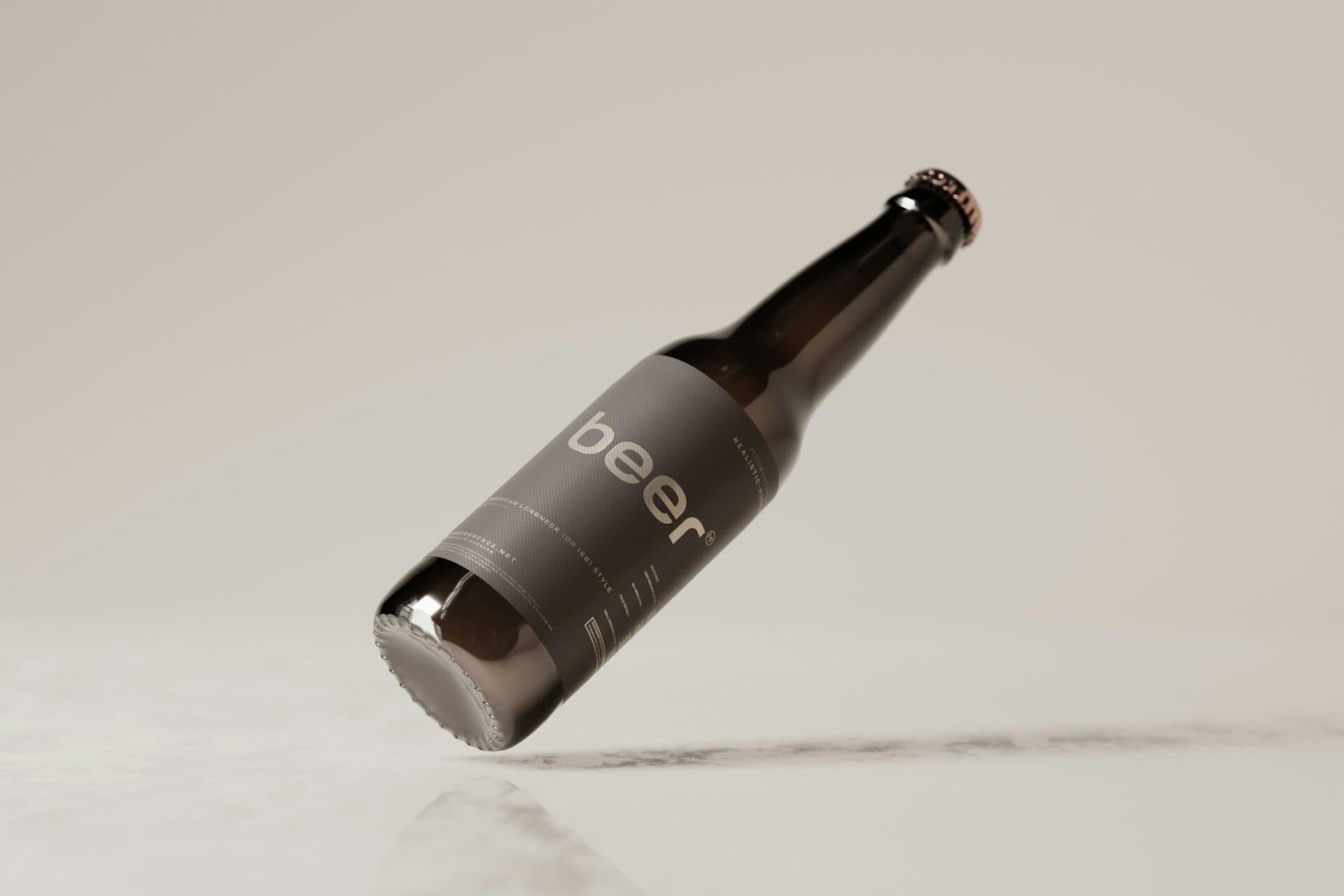
Craft Beverage Label Design
Label design for Black Bottle, a small-batch craft spirit with a bold character and a story worth telling. The brief was unambiguous: dark, confident, no compromises. The kind of bottle you pick up because you have to know what’s inside.
Full-bleed black, the brand name set large and vertical in a compressed grotesque — no illustration, no decoration. A limited collector’s run introduced a single metallic gold element. Restraint used well is its own kind of luxury.
View Details
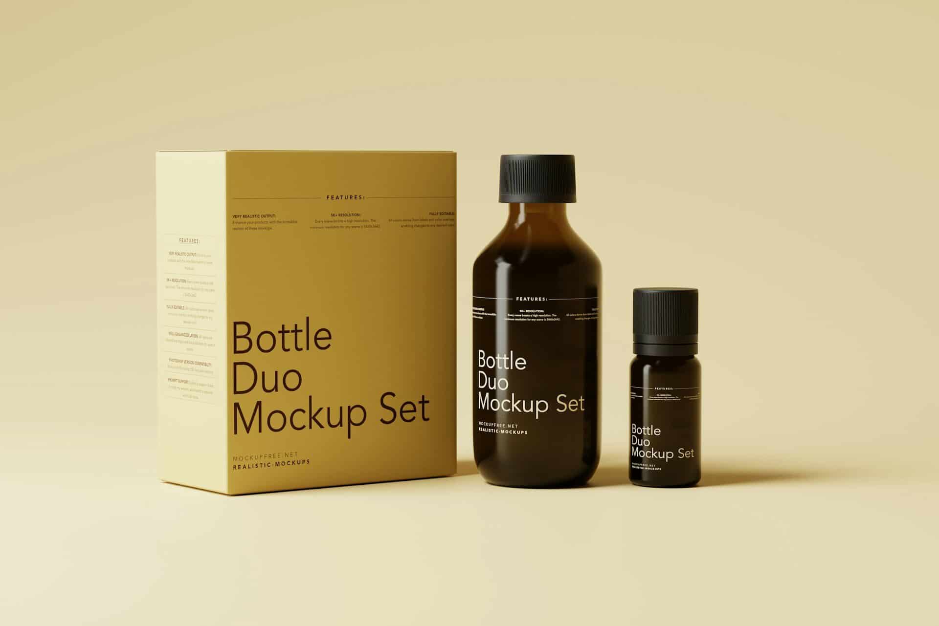
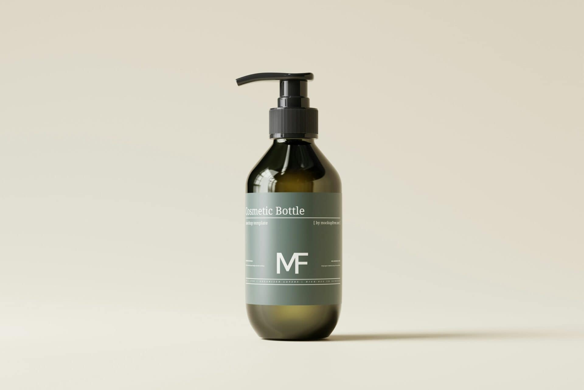
Premium Serum Brand Identity
Full brand identity and packaging system for Sleek+, entering the premium facial serum market. The brand needed to position confidently against established competitors while communicating a rigorous, science-backed approach to skincare.
A deep amber and warm gold palette — unusual in a category dominated by clinical whites — gives the brand an immediate visual signature. The system scales cleanly across serum, eye cream, and moisturiser formats.
View Details
Artisan Soap Packaging
Packaging for a small-batch artisan soap brand moving upmarket. The challenge was to feel handcrafted and genuine without tipping into the rustic clichés that saturate the natural beauty sector.
Hand-drawn botanical illustration — one motif per variant, drawn from the key ingredient — sits within a consistent label structure tied together by a shifting palette. A small brand that now looks like it means business.
View Details